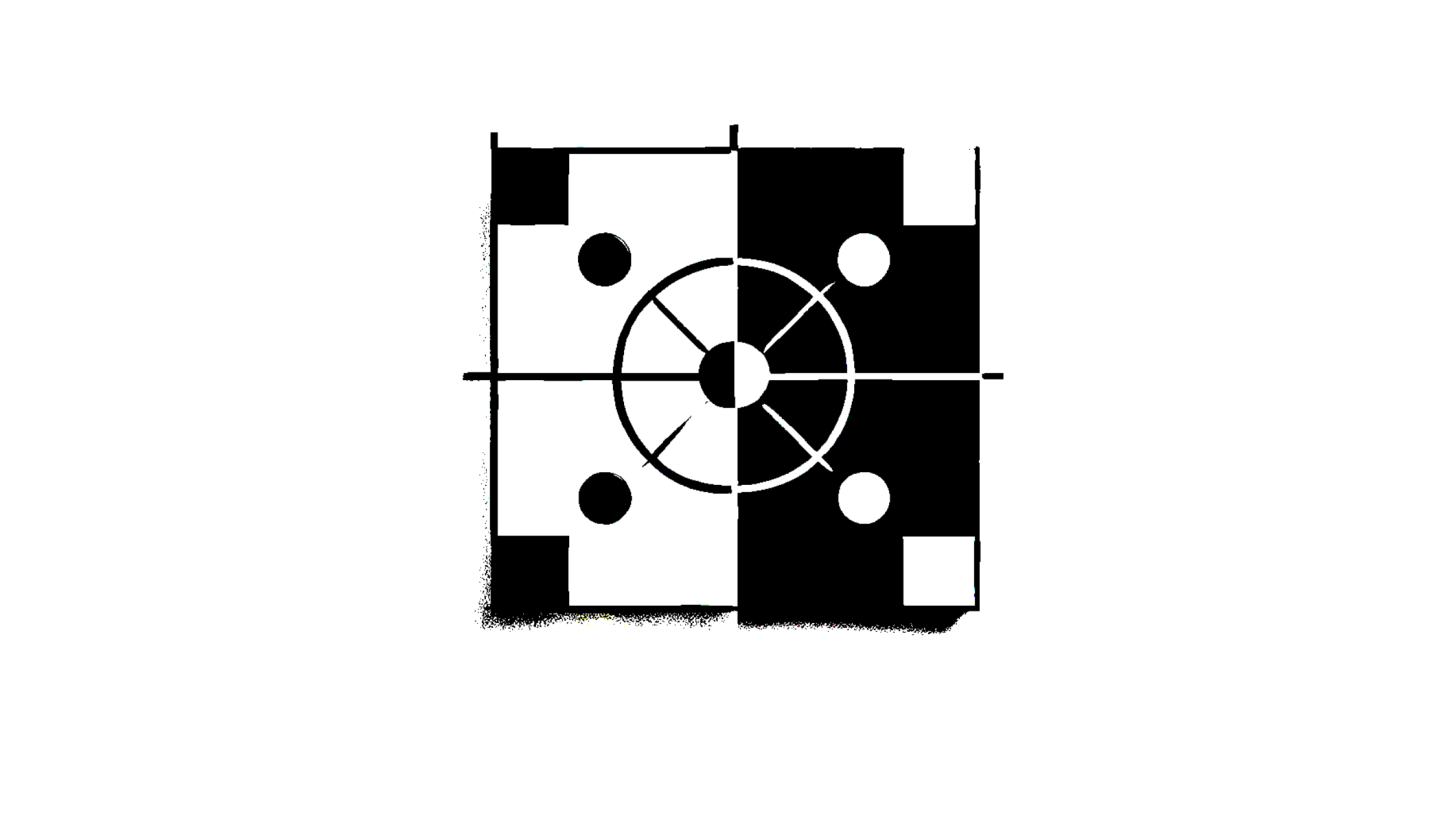
The Science of Attention
How to Use Color and Contrast to Capture the Viewer's Focus
Introduction
Imagine you're looking at a busy street filled with signs, billboards, and flashing lights. Your brain has to pick out one thing from all of this chaos, and it's doing so quickly. The reason your eyes go to a bright red stop sign or a flashing neon light is because of something called attention, and it's heavily influenced by color and contrast. Just like how certain colors make you feel different emotions, they also grab your attention in specific ways. When designing ads, the right use of color and contrast can make a huge difference in capturing the viewer’s focus.
Background
The study of attention and its connection to color and contrast has its roots in both psychology and neuroscience. Key researchers, such as David Hubel and Torsten Wiesel, whose groundbreaking work on visual perception earned them the Nobel Prize in 1981, paved the way for understanding how our brain processes visual stimuli. They discovered that our brains respond strongly to contrast and movement, both of which are heightened by color differences. This scientific understanding has greatly influenced how advertisements use color and contrast to enhance attention.
Historical Experimentation
A landmark experiment that demonstrated the power of color and contrast in grabbing attention was conducted by Hubel and Wiesel in the 1950s at the Johns Hopkins University. Their experiment, titled "The Organization of the Visual Cortex", involved examining the responses of neurons in the visual cortex of cats when exposed to various visual stimuli. The experiment showed that neurons in the visual cortex are most responsive to high contrast images, such as black and white stripes, and these neurons are more activated when the contrast between elements is sharp.
Published in The Journal of Physiology, this experiment had huge implications for understanding how our brains perceive visual elements and how high-contrast, sharp changes in visual stimuli can quickly capture attention. This finding later contributed to how designers and advertisers use contrasting colors in ads to ensure their messages stand out.
Connection to Human Evolution/Biology/Neuroscience
The ability to quickly identify contrasting colors and visual patterns can be traced back to human evolution. Early humans needed to quickly detect changes in their environment—such as predators or food sources. The brain evolved to prioritize high-contrast elements that signaled important changes. For example, the bright color of a fruit would stand out against the green of leaves, or a predator might be more noticeable due to the contrast in its movement against a still background.
Today, this evolved preference for contrast and color plays a significant role in advertising and design. Our brains are wired to pay attention to elements that stand out, making color and contrast crucial tools for capturing attention.
Recent Research & Experimentation
More recent studies have continued to explore how color and contrast influence attention, particularly in advertising. In 2018, researchers from the University of Toronto published an experiment titled "The Effects of Contrast on Consumer Attention and Memory" in The Journal of Consumer Research. The study explored how consumers' attention is directed to different colors in advertising and how that influences memory retention. The findings showed that ads with high contrast colors (e.g., red on black or yellow on blue) are more likely to be noticed and remembered compared to ads with low contrast.
These results have significant implications for advertising. By strategically using high-contrast color combinations, marketers can ensure their ads attract attention and are remembered by their target audience. This experiment reinforced the earlier work by Hubel and Wiesel, providing modern-day evidence that color and contrast remain key factors in capturing attention.
Conclusion
In the world of advertising, grabbing and holding the viewer’s attention is essential. The science behind color and contrast can help advertisers design more effective and engaging ads. Using high-contrast combinations, like bright red against a dark background, ensures that your ad is noticeable, memorable, and likely to capture the viewer’s attention in a crowded marketplace. Marketers and designers should leverage this knowledge to create ads that stand out and resonate with their audience.
More Behavioral Science


How Posting at the Right Moment Makes Content More Likely to Go Viral